

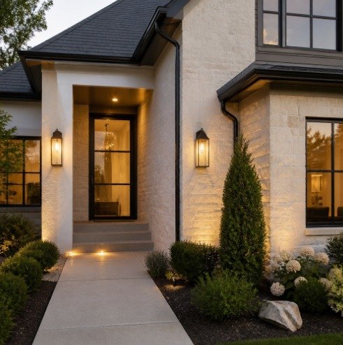
Most people planning an exterior refresh start with the big, expensive things: render, a new front door, block paving, maybe a porch. Then they stand at the end of the drive, squint, and realise the house still looks slightly unfinished. Nine times out of ten the culprit is the address — a set of brass digits bought in a hurry from a DIY shed in 2004, one of them hanging at a tilt, another a shade darker than the rest because it was replaced after a storm.
House numbers are the smallest permanent element on a façade and the one people look at first. Delivery drivers hunt for them. Visitors scan for them. Buyers photograph them without realising. Getting them right costs a fraction of what a new door costs, and the visual return is wildly disproportionate. Here is how to choose, order and fit them properly.
Start with distance, not style
The single most common mistake is buying numbers that are too small. People choose a height that looks generous when they hold the digit in their hand at arm’s length, then fix it to a wall that is read from fifteen metres away across a hedge.
Walk to the point on the pavement or road where a stranger would first try to read your address. That is your sightline. As a rough working rule, numbers mounted beside a front door on a terrace or townhouse — read from five to eight metres — look balanced at around four to six inches tall. A detached house set back behind a front garden usually needs six to eight inches. Anything further back than twenty metres, or anywhere a car is moving past at speed, wants eight inches or more, or a plaque positioned at the gate rather than on the house.
Contrast matters as much as size. Dark bronze numbers on a dark grey slate wall will disappear at dusk no matter how large they are. Satin black on white render, or brushed aluminium on dark brick, reads cleanly in almost any light. If your wall is busy — flint, mixed stock brick, heavy pebbledash — a plaque gives the digits a calm background to sit against and will almost always outperform individual numbers fixed straight onto the texture.
Matching the numbers to the building
Modern sans-serif numerals are not only for modern houses — they work beautifully against Victorian brick precisely because the contrast is deliberate rather than accidental. What does not work is pseudo-period lettering on a 1990s estate house, or a cursive script on anything read from a distance. Script loses legibility first and ages fastest.
A few practical pairings worth considering:
- Red or orange brick: black or dark bronze finishes, or a white-faced plaque if the brick is heavily variegated.
- White or pale render: black, dark grey or brushed aluminium; avoid white-on-white unless the numbers stand well off the wall and cast a shadow.
- Timber cladding and painted weatherboard: brushed metal finishes, which pick up the grain without competing with it.
- Glazed front elevations and composite doors: a horizontal plaque mounted beside the door at eye height, rather than numbers scattered across glass or frame.
Orientation is the detail people forget. Vertical stacks suit narrow brick piers and the slim strip beside a front door. Horizontal runs suit wide walls, fence panels and gateposts. If you have both a gate and a door, pick one to carry the address and let the other stay quiet — two competing sets of numbers look indecisive.
Where house numbers fit into a wider exterior plan
Signage should be the last item on the list and the first one specified. Decide the finish early so your door furniture, letterplate, bell push and outside light belong to the same family, then fit the numbers after painting and rendering are done. Mixing polished chrome handles with warm bronze digits is the kind of mismatch that nobody can name but everybody notices.
It is a particularly cheap win if you are selling. Anyone who has been through the process with estate agents preparing a home for a successful sale will recognise the pattern: the photographer arrives, the lead image is a straight-on shot of the front elevation, and every small flaw in that frame gets magnified. Crisp, well-spaced numbers tell a viewer scrolling through listings that the house has been looked after. Crooked ones suggest the opposite, fairly or not.
If you want to see how varied the options really are before committing, this round-up of house number ideas for different exterior styles is a useful visual starting point — particularly for backlit mounting, planter-mounted plaques and gate-post placement, all of which read very differently in daylight and after dark.
Ordering custom numbers without the guesswork
Bespoke signage used to mean a sign-maker, a three-week wait and a nervous conversation about spacing. That has changed. Specialist makers now let you configure font, height, finish and orientation, see the result before you commit, and get hardware designed to be invisible once fitted. One long-established option in this field is Modern House Numbers, a family-run business that has been handcrafting custom numbers, letters, address plaques, welcome signs and mailbox decals to order in Tucson, Arizona since 2008, precision cut from solid recycled aluminium and shipped to customers internationally, including Australia. Orders include a free personalised full-scale drilling template, step-by-step instructions and concealed hardware, which removes the part of the job most people get wrong — the marking out. There are QuickShip numbers for anyone working to a tight deadline, curb stencils and mailbox decals for the rest of the frontage, gift cards, and a trade programme for designers, builders and renovators specifying across multiple properties.
Fitting them so they stay straight
Take your time on the template. Tape it up, stand back at your sightline, and look at it in morning and evening light before you drill anything. Paper is cheap; brick is not.
- Check the height. Numbers set at roughly eye level to shoulder height read best; above the door head they catch shadow and become hard to see.
- Drill into mortar joints where you can on brick walls — easier to patch if you ever move the numbers, and kinder to the brick face.
- Use the correct plug for the substrate. Render over blockwork, solid brick and timber cladding all behave differently under load.
- Check level and spacing before the final tighten. A millimetre of drift per digit becomes obvious across four numbers.
- Think about light. A wall light above or beside the address, or a low-level uplighter, means the house is findable at eleven at night as well as at eleven in the morning.
Worth doing properly once
An address is one of the few exterior elements you fit once and then forget about for twenty years. That makes it worth half an afternoon of thought: the sightline, the contrast, the orientation, the finish that matches your door furniture. Get those four decisions right and the rest of the frontage — paint, planting, paving — has something to organise itself around.
